
Brand Identity
Baindo
To bind — the art of connecting businesses with new markets.
- Industry
- Business Consulting · Market Entry & Expansion (Colombia & LATAM)
- Services
- Brand Strategy, Brand DNA, Visual Identity, Logo & Symbol Design, Color & Typography System, Brand Applications, Brand Guidelines.
Context
Baindo Group is a consulting firm built to transform how companies enter and operate in Colombia and Latin America. With over 14 years of hands-on, executive experience across gastronomy, franchising, engineering, and business services, Baindo connects ambitious businesses with new markets — guiding them through soft-landing, sourcing, and commercial expansion.
The name says it all. "Baindo" (バインド) means "to bind" in Japanese: to unite. It reflects the firm's core purpose — connecting entrepreneurs, suppliers, and opportunities so ideas can take root and grow.
Strategy
A consultancy operating across borders lives or dies on trust. Baindo needed an identity that felt as structured and reliable as the expansion strategies it sells — sober, expert, and contemporary, without falling into the generic clichés of the sector (compasses, puzzle pieces, globes).
We built the brand around a single, ownable idea: connection. Four directions converging into one stable core — Strategy, Soft-Landing, Operation, and Expansion — became the conceptual and visual backbone of everything.
"Smart expansion. Real results."
Solution
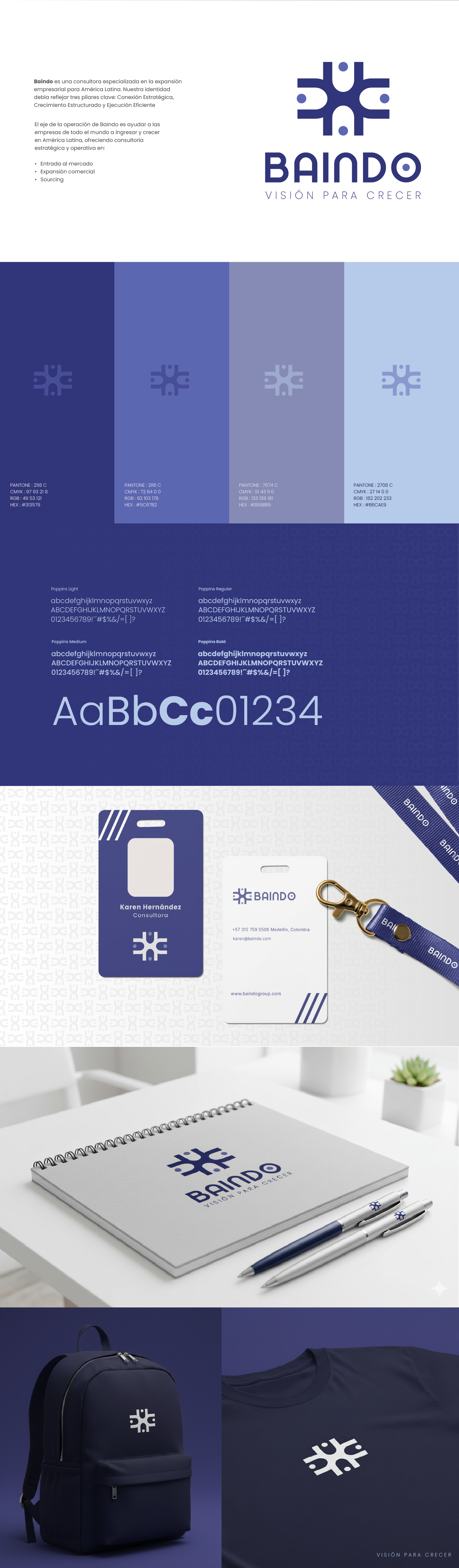
The result is a complete identity system where every element traces back to the idea of binding. The symbol — a dynamic four-armed cross acting as a visual compass — anchors the brand: each arc points to a cardinal direction and a service pillar, the outer points represent the allies and clients converging from every side, and the central node embodies Baindo's team.
- Symbol & logotype — a custom four-armed mark paired with a bespoke geometric wordmark.
- Color system — a confident blue-to-indigo palette (#313579, #5C67B2, #B6CAE9) signalling stability, professionalism, and structured growth.
- Typography — Poppins, a geometric humanist sans, for clarity across print and digital.
- Pattern — a repeating graphic system derived from the symbol, used as texture and connective tissue across applications.
- Applications — stationery, brochure, merchandising, social templates, and the brand guidelines that keep it all consistent.
Result
A solid, expressive identity that unites the ancestral idea of connection with a modern, strategic voice — transmitting the confidence and rigor that define Baindo as it helps businesses cross borders and grow.
Brand Strategy, Visual Identity & Design: Ambishus.
Client: Baindo Group — baindogroup.com